Substack redesigns its mobile app

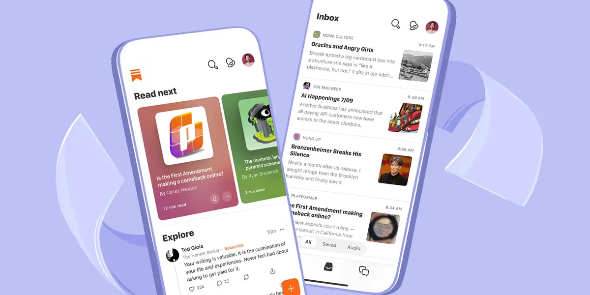
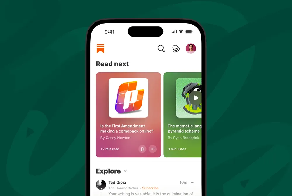
Substack, the popular newsletter platform, has unveiled a redesigned mobile app to enhance user discovery and engagement. The update comes as the company grows significantly and aims to provide users with a more seamless and immersive reading experience.
The redesigned app introduces several new features that make it easier for readers to discover and engage with newsletters. One of the key additions is the Explore tab, which allows users to browse through a curated selection of newsletters based on their interests. This feature aims to help readers discover new writers and topics that align with their preferences, expanding their reading horizons.
Substack has introduced a new commenting system within the app to enhance engagement further. Readers can now leave comments on individual newsletter posts, fostering a sense of community and enabling discussions around the content. This feature encourages interaction between readers and writers and provides valuable feedback and insights for newsletter creators.
The new design focuses on readability, making it easier for users to consume content on their mobile devices. The app also supports dark mode, providing a more comfortable reading experience in low-light conditions.
The mobile app redesign coincides with Substack’s efforts to transform its platform into a more social network-like experience. Last month, the company introduced a feature that allows users to follow writers, providing them with a means to stay updated on a writer’s activities without the need to subscribe to their newsletter.
Since Elon Musk assumed control of the company last year, Substack has been actively pursuing a challenge against X (formerly known as Twitter). The company made its most prominent attempt to compete with X when it introduced its Twitter-like Notes feature in April.

Source: SubStack


